
6/11 Weekly Macro Report - Soft Data, A Canadian Economic Ice Storm, Jobs Report and Economic Update from GCC, FHLB Details, and More
This weeks update features macroeconomic data highlighting some further softness in different economic sectors, details on the Canadian economy, and great contributor research.

Weekly Charts and Data Update (@DonMiami3)
Keeping this week's update shorter than normal - busy evening on the work front and a huge week of economic data and events ahead, so stay tuned for a week of busy DJ Twitter activity. Last week we saw a broad slowdown across the ISM economic data - highlighting a slowdown in everything from employment activity, to services, new orders and more. The newly created logistics manager index also printed it’s weakest reading since the inception of the index - and the tweet that I posted for that caught huge eyes across Twitter. Lastly - I’ll cover the jobs data (initial claims and continuing claims) - which highlights some potential early-stage cracks in what’s been a white-hot labor market.
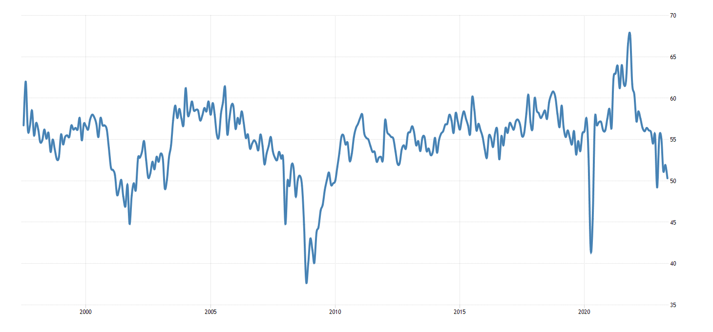
The ISM services index posted some data pointing to weakness in the service sector - nearing the 50 level (indicating contraction in the service sector). According to the Institute for Supply Management (ISM), the ISM Services Purchasing Managers' Index (PMI) declined to 50.3 in May 2023 from 51.9 in April, signaling the fifth consecutive month of expansion in the services sector, albeit at a slower pace. These figures fell below the anticipated forecast of 52.2, reflecting a deceleration in business activity, new orders, and new export orders. Additionally, employment contracted, and supplier delivery times improved. These developments can be attributed to sluggish demand, which also resulted in increased inventories. Moreover, price pressures eased to their lowest level since May 2020. Anthony Nieves, Chair of the ISM Services Business Survey Committee, noted that while many respondents perceive stable business conditions, concerns remain regarding the decelerating economy. (Source: ISM Services PMI, May 2023).
Service workforce numbers weakened as well to below 50 - highlighting further weakness in service employment which has been extremely resilient.
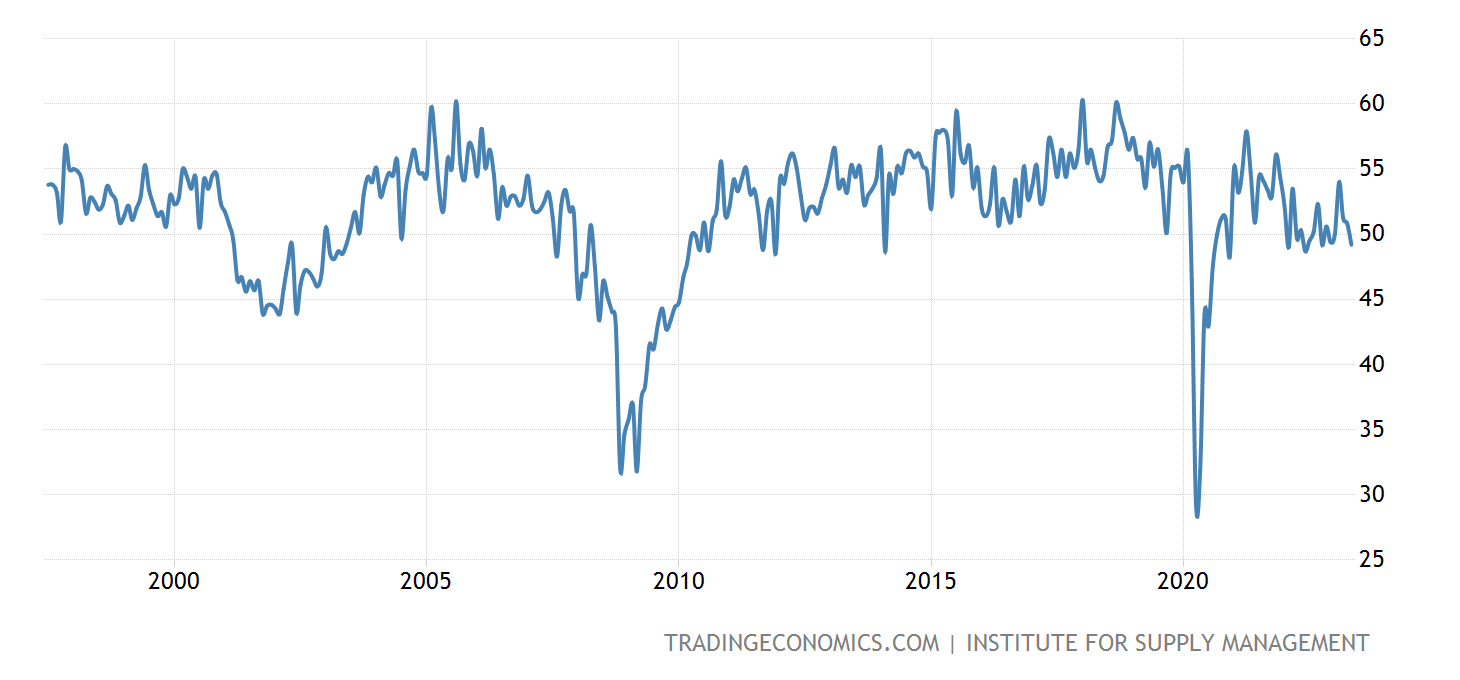
The service sector business activity measurement posted its weakest reading since May of 2020 - and usually declines into downturns.
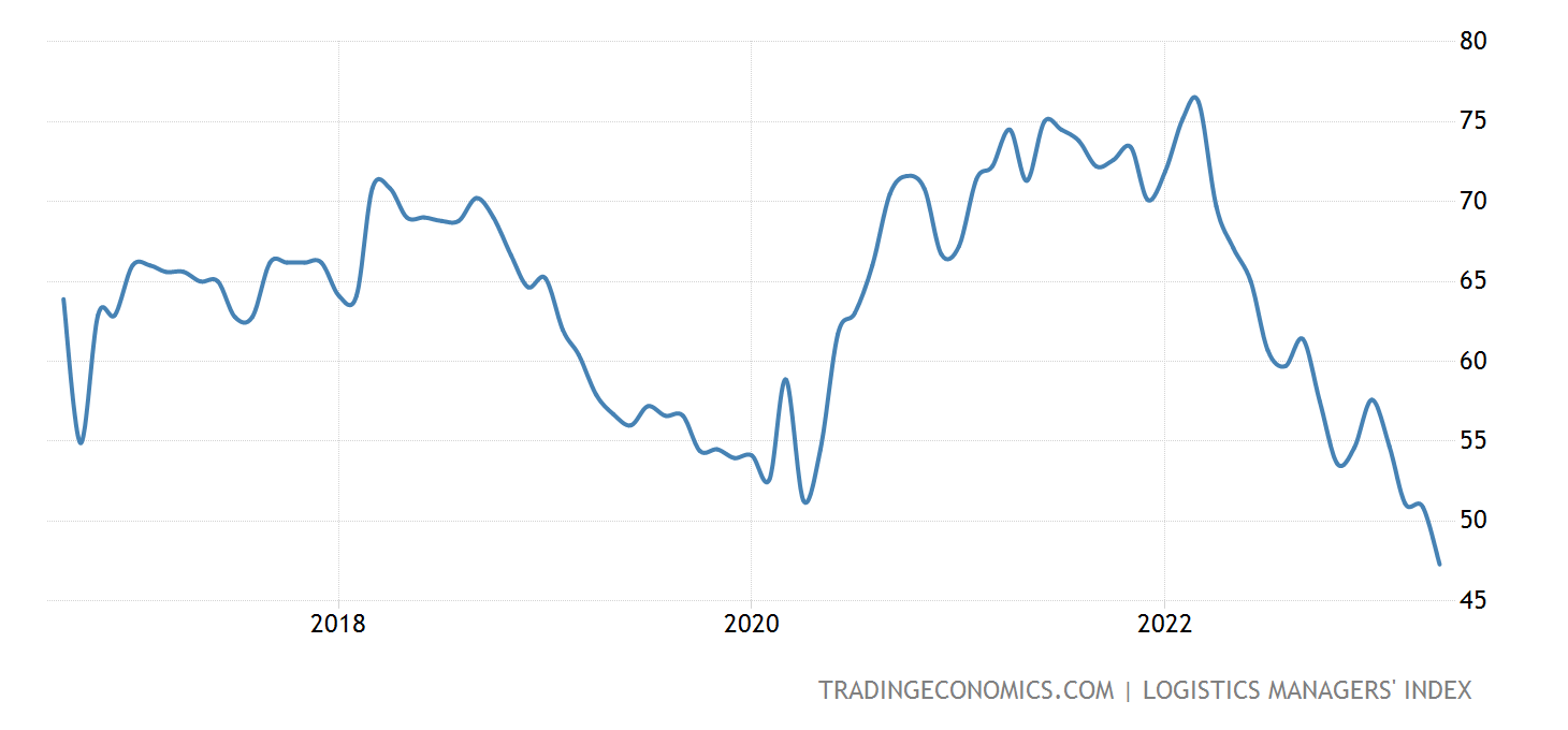
The Logistics Manager's Index registered a record low of 47.3 in May 2023, marking the third consecutive month of decline compared to the April reading of 50.9. This contraction in the logistics sector, a first in nearly seven years, primarily stems from the ongoing softening of the freight market. The transportation utilization gauge, which indicates available space usage, pointed to contraction (-9.5 to 45.5), suggesting reduced utilization by shippers. Moreover, transportation prices experienced the largest contraction on record (-8.9 to 27.9). Contrarily, restocking inventories offer little respite for carriers, as inventory levels declined for the first time since February 2020 (-1.5 to 49.5). This decline is driven by upstream manufacturer and wholesaler inventories, while downstream retail inventories continue to grow. Warehousing prices, although rising, are expected to decline as long-term contracts signed in 2020 and 2021 expire. (Source: Logistics Managers' Index)
The upcoming busy week of data releases is expected to provide valuable insights into the economic trajectory for the next few months, particularly as the Federal Open Market Committee (FOMC) weighs the decision regarding a potential rate hike or pause in June. The data points towards a relatively mild recession at present, with indicators like the Senior Loan Officer Opinion Survey (SLOOS) indicating tightening credit standards. Additionally, the notable semiconductor inventory build further underscores the prevailing slowdown across the economy. These broad data trends collectively support the notion of a continued deceleration in economic activity.
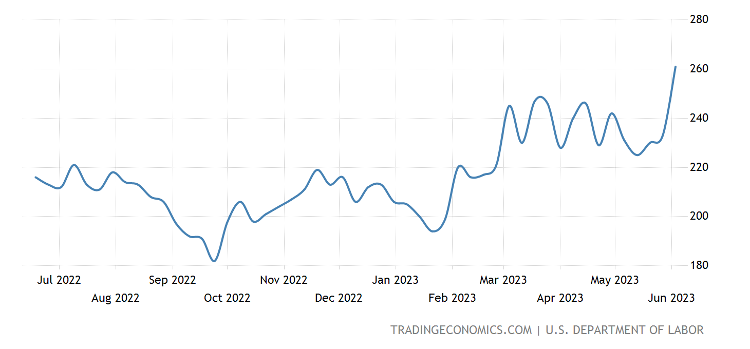
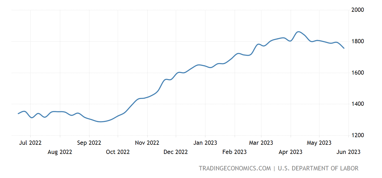
We’re seeing some ‘potential’ weakness in the labor market - with initial claims at its highest level since October 2021 - posting a print of over 260,000 unemployment claims filed for the first week of June - well above expectations. Interestingly enough, continuing claims dropped a big - although the 4-week moving average advanced higher - so the single-week drop could be a blip on the radar in the grand scheme of a higher initial claims print. Let’s see how continuing claims looks over the next 4 weeks to get a better idea of where this is trending and if active filers are filling in new job positions (still many millions of openings according to JOLTs).
The upcoming busy week of data releases is expected to provide valuable insights into the economic trajectory for the next few months, particularly as the Federal Open Market Committee (FOMC) weighs the decision regarding a potential rate hike or pause in June. The data points towards a relatively mild recession at present, with indicators like the Senior Loan Officer Opinion Survey (SLOOS) indicating tightening credit standards. Additionally, the notable semiconductor inventory build further underscores the prevailing slowdown across the economy. These broad data trends collectively support the notion of a continued deceleration in economic activity.
A “Canadian Ice Storm” (@ManyBeenRinsed)
The dead cat bounce in Canada has come to an abrupt end. Even prior to the BoC hiking 25bps this past week it seemed showings, sales, bidding wars were all dwindling. Many houses are now struggling to see any offers at all now. The housing market can quickly change on a dime as we saw in 2022 and I expect the rest of 2023 to be no different. The FOMO subsided fully on Wednesday when the Bank of Canada (BoC) raised interest rates 25bps after being on pause for a few months. This was a psychological killer to the market and its participants. There's a few data points being released now until the next BoC meeting but it seems another 25bps hike in July is a given. Unemployment has also started to tick up while housing inventory explodes country-wide. Immigration continues to flow as Canada welcomed 83K+ newcomers. Judging by the unemployment numbers it seems many of the newcomers are not finding jobs. This is a recipe for disaster. One of the biggest narratives in Canada is immigration and how it will support our astronomical housing and rent prices. What's concerning moving forward is that banks continue to further tighten lending, employment is just doing okay and food prices continue to rip. Oil hasn't even made it's move upwards. Buckle up. Many parts of Canada saw 30-40% price drops in 2022. What happens on the next leg down? Yikes. Canadian yields have exploded higher over the past 2 weeks pushing many mortgage terms and rates 5%+. This is for sure to put a damper on pricing moving forward. It will be an interesting summer.
The Labor Market and the Economy (@GregCrennan)
When it comes to analyzing employment data, it's important to recognize the multitude of datasets available. Among these, two prominent surveys often capture attention: the widely-publicized Payroll survey and the lesser known Household survey. Friday's Payroll survey, for instance, made headlines by reporting an addition of 339,000 jobs, while the Household survey revealed a concerning decline of -310,000. Surprisingly, many individuals are unaware of the existence of these two distinct surveys. So, what sets them apart? The Bureau of Labor Statistics clarifies the disparity: "Employment estimates from the payroll survey represent a count of jobs, whereas the household survey provides an estimate of the number of employed or unemployed individuals. If one person holds multiple jobs during the reference period, both positions would be accounted for in the payroll survey figures." Meaning, one person is working multiple jobs, while the actual number of individuals unemployed are rising. Gaining awareness of these divergent methodologies is crucial for comprehending the true state of the economy, which currently faces the challenges of stagflation.
Today's job report reveals a perplexing dichotomy between the Payroll survey and the Household survey, shedding light on an unsettling phenomenon within the labor market. The Payroll survey indicates an increase in jobs, suggesting that more individuals have gained employment. However, the contrasting data from the Household survey paints a bleaker picture, showing a rise in unemployment rates and a shrinking labor force. This puzzling scenario suggests that while some individuals may have secured additional employment, there is a larger segment of the population grappling with unemployment. This discrepancy implies a growing number of individuals who are forced to take on multiple jobs in order to make ends meet due to inflation, further exacerbating the challenges faced by those seeking employment opportunities.
The analysis presented gains further credibility when examining the data from the ADP report from Thursday, which reveals a notable trend within the job market. Out of the 278,000 overall job gains, a significant portion of 208,000 can be attributed to the Leisure and Hospitality sector, (bars, restaurants, and hotels). This observation is particularly intriguing as these roles often serve as secondary employment options for individuals who already have a primary job. These positions, such as waiting tables or bartending during evenings or weekends, provide supplementary income for workers. This emphasizes the prevalence of individuals seeking additional sources of income to supplement their main occupation, reflecting the challenges faced by many in attaining full-time employment opportunities. It underscores the importance of addressing the underlying causes of this trend, such as general inflation, wage stagnation, or limited access to stable, well-paying jobs, in order to foster an inclusive and resilient labor market. You may wonder why people are taking on second jobs, the answer is that over the past 2 years, real wages have been down compared to the rate of inflation. Meaning the average salary is not keeping up with the daily cost of living.
As we look ahead to the future, the forecast for unemployment appears increasingly concerning, with a steady upward trajectory anticipated. The looming threat of numerous companies facing bankruptcy further exacerbates this predicament. While it is unlikely that unemployment will reach the unprecedented levels witnessed during the Covid-19 pandemic, unless a similar catastrophic event occurs, we find ourselves grappling with a distinct economic phenomenon known as stagflation recession. This rare combination of economic factors, characterized by a sluggish economy, persistent inflation, and a stagnant labor market, harkens back to a period not witnessed since the 1970s.
In summary, the prevailing narrative of a strong economy and the absence of a looming recession seems disconnected from the reality on the ground. Alarming indicators, such as the significant surge in unemployment as revealed by the household survey, the proliferation of individuals seeking lower-paying positions in the leisure and hospitality sector, and the persistent discrepancy between inflation and wage growth, paint a starkly different picture. The unsettling truth is that Americans are working harder while receiving diminished returns, a clear testament to the presence of a stagflation recession. This detrimental economic condition not only undermines financial stability but also erodes the overall quality of life for the average American.
The FHLB, the (secret) GSE for Liquidity (@VanClvg)
Happy Sunday everyone! In this writeup, we will be focusing on the Federal Home Loan Banks, and their role in providing the banks with emergency liquidity in the current (and sickly) banking landscape, specifically those that are in a particular amount of trouble(which we will illustrate later). The FHLB, though created in the wake of the Great Depression to make it easier for regular people like you and me to borrow money to buy homes, has largely been used exclusively by commercial banks since the late 1990s leading up to the Dotcom bubble. Originally aimed at ensuring banks have cash to lend to homebuyers, the FHLBs are now almost completely used to ensure the banks have enough cash to not go under.
First, some context and background, as I like to try to give you readers a full understanding of what exactly we are dealing with here. In November 2008, a month after Lehman Brothers collapsed and thus kicking off the GFC, the FRBNY procured a report titled: “The Federal Home Loan Bank System: The Lender of Next-to-Last Resort?” which goes through an in-depth analysis of the role of the FHLB in providing emergency liquidity backstops to commercial banks during the crisis. You can read the report for yourself here: https://www.newyorkfed.org/medialibrary/media/research/staff_reports/sr357.pdf The crux of the paper is summarized in the introduction:
“...at the outset of the liquidity crisis, the Federal Reserve saw little demand for primary credit through its Discount Window -- even after lowering the discount rate from 100 basis points to 50 basis points above the Federal Funds target. Some observers attributed the lack of Discount Window lending during this period to the notion of there being a ‘stigma’ to such borrowing insofar as it would send an adverse signal about the financial viability of the borrower. However, the lack of borrowing from the Discount Window can also be explained by the presence of an alternative, lower cost government-sponsored liquidity backstop: The Federal Home Loan Bank System (FHLB) System. “
So, there you have it. From the Fed itself, the FHLB is the speakeasy liquidity facility for the commercial banks to get cheaper dollar funding, without the stigma of going to the Federal Reserve. Banks panic borrow at the FHLB before they panic borrow at the Fed.
It has come to my attention that the FHLB has recently received some mainstream coverage via Bloomberg and others, and for good reason. Earlier in March, the FHLBs hit headlines for providing over $300B in a single week to banks in distress looking for a stable source of funding, and active avoidance of ringing alarm bells by going to the Fed’s overnight discount window. More recently, on June 4, Bloomberg also reported that advances from the FHLB totaled to about $1.5T. Here are those articles:
https://www.bloomberg.com/news/articles/2023-03-20/fhlb-issues-304-billion-in-one-week-as-banks-bolster-liquidity?leadSource=uverify%20wall
https://www.bloomberg.com/news/features/2023-06-04/us-effort-to-help-homebuyers-get-affordable-loans-mainly-benefits-banks-instead?srnd=premium
This $1.5T figure in particular far surpasses the amount of advances reported in both the Q1 2023 FDIC Quarterly Banking Profile, and the Q1 ‘23 FHLB Office of Finance’s Combined
Operating Highlights (both of which I wrote about on my Twitter in May). The Q1 QBP reported ~$800B (although this is not reflected in the FRED data I provide later), and the FHLB COH reported ~$1.04T. Those threads can be found here, and I highly recommend reading them (not for my clout, but rather your own benefit):
https://twitter.com/vanclvg/status/1631540141939646464?s=20
https://twitter.com/vanclvg/status/1653639944097927171?s=20
https://twitter.com/vanclvg/status/1664154636708872193?s=20
Knowing that the banks go to the FHLB for emergency liquidity before the real trouble starts, this rapid jump is quite alarming, to say the least. That’d be over a 50% increase QoQ! Anyway, it’s time for my favorite, colorful squiggly lines! Let’s look at some charts.
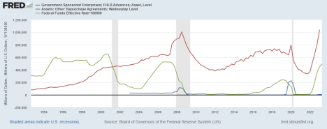
Here, I adjust Fed Funds and Repo to line up with the quarterly reporting nature of FHLB data. Looks like FRBNY was right, FHLB borrowing precedes that of borrowing at the Fed’s discount window(repo). The only exception being where the orchestrated (yes, orchestrated, read my piece in last week’s edition of MacroEdge) repo crisis kicks off, with advances moving in tandem with repo. It is also apparent that the banks do not like tightening lending standards in the form of higher interest rates, as higher rates seems to be what initiates the liquidity scrambling to begin with. Whether that is lack of interest rate hedging mechanisms or just outright malpractice on behalf of the banks, I am not sure, nor do I think the “why” matters a whole lot. What is apparent is that FHLB borrowing increases well before both repo borrowing and the beginning of the recessions themselves. A leading indicator? I think so. According to this data, current FHLB advances total to about $1.04T, as reflected in the FHLB COH(not the Q1 QBP?), and it is official: we have surpassed the peak in FHLB panic borrowing achieved in Q3 2008, the very midst of the GFC. Huzzah! The banking system is totally stable! Going back to the Bloomberg numbers, we have already surpassed this by ~$500B. Oh yeah, it’s fine, everything is fine. No contagion to see here! Some speculation, but if things ended with the “regional” banking crisis back in March and everything is fine, why does FHLB borrowing continue to rise? Spoiler alert: this banking crisis is not regional, and it is far from over. We are in the eye of the storm. Remember, Bear Stearns in March, Lehman Bros. in September.
I want to illustrate this sickliness further, however. As of annual reporting by the big banks that failed, we know that Silicon Valley, Silvergate, Signature, and First Republic all tapped into FHLB lending/panic borrowing shortly before their demise the next quarter. Silicon Valley,
for example, was the biggest known borrower from FHLB of San Francisco, with ~$15B in advances due in short-term loans to be paid back in less than a year. We can find how much they borrowed using FDIC data. It is with this data I built the following spreadsheet (thank you John Titus for the methodology) that compares FHLB loans taken out by the top 34 banks (assets over $100B) in the US with their total equity capital. Why equity capital? Equity is the banks’ financial cushion for losses, an essential component of their capital structure and contributes to the overall resilience of the banking system. Without sufficient equity, banks go bust. Using a spreadsheet makes it easier to find derived values that the FDIC doesn’t provide, such as FHLB advances as a % of total equity, which is exactly what I highlight here. It is quite telling of the condition of the US banking system, and outright annihilates the notion that this crisis is secluded to regional banks, and is over entirely. Highlighted in dark red on the left are failed banks (all of which appear in the top 34, does anyone still believe that this is from small and regional banks?), and the different colors on the right signify different percentages of equity in FHLB advances in the following brackets: <20%, >20%, and >50%.
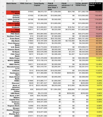
WOW. Safe to say, the failed banks were already in deep sh*t well before they went down in March, figuring nearly the entirety of their equity (Signature Bank well surpassing their total, along with Schwab and USAA) was due back this year, assuming these loans from the FHLB were taken out solely in Q4 2022. This, and the unrealized losses on behalf of these banks, is most likely what led to the mass deposit flight by whale accounts (more than the $250K FDIC insurance) that caused these banks to completely implode. Solvency issues existed well before the liquidity issues, and this is true for ALL of the banks in the US. I am currently working on expanding this list to include all banks over $50B in assets to get a fuller picture on the health of the US banking system. Since these banks comprise most of the money in the US however, this is a big enough picture for me to come to the conclusion that this is NOT a regional banking crisis and this story is far from done. As I said earlier, we are in the eye of the storm, with more difficult times ahead. I would not be surprised to see any of these banks in the red and orange to follow suit of their defunct counterparts. I, for one, am not in any of these banks, nor do I trust my money to be kept there, but I am not telling anyone to act, as you should do with this info as you see fit, and your own due diligence.